

Designing for Connection: Accessibility in WhatsApp for Older Adults
Role
UX Researcher, UX Designer, UI Designer
Timeline
December – May 2025 (6 months)
Designing for Connection explores how small interface decisions can create or hinder meaningful communication for older adults using WhatsApp.
Over the course of five months, I led a human-centered redesign process, from conducting interviews and usability studies to prototyping solutions based on real user struggles. The project resulted in a set of accessibility-driven interface updates aimed at making WhatsApp more readable, navigable, and error-resistant for aging users
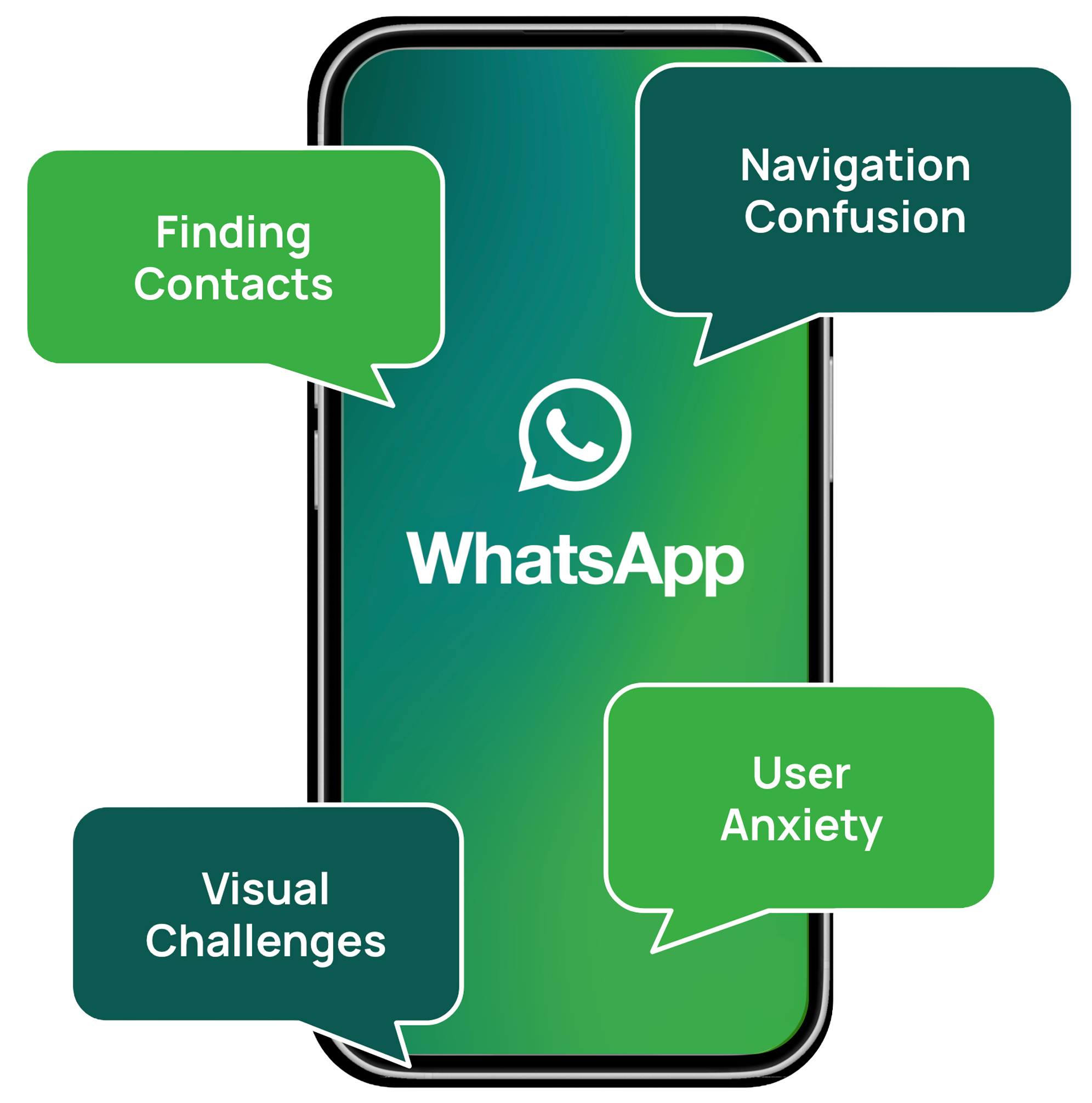
WhatsApp is a critical communication tool across generations, yet its interface presents usability challenges for many older adults.
Users over 50 often struggle to locate contacts in long chat lists, read small text comfortably, and avoid accidental interactions such as unintended calls. These barriers reduce confidence and make everyday communication more difficult.
This project investigated the root causes of these issues and redesigned key interactions to improve clarity, reduce friction, and support a more accessible messaging experience.
The Problem-

Through interviews, surveys, and usability testing, several clear usability patterns began to emerge.
Key Findings
-
![]()
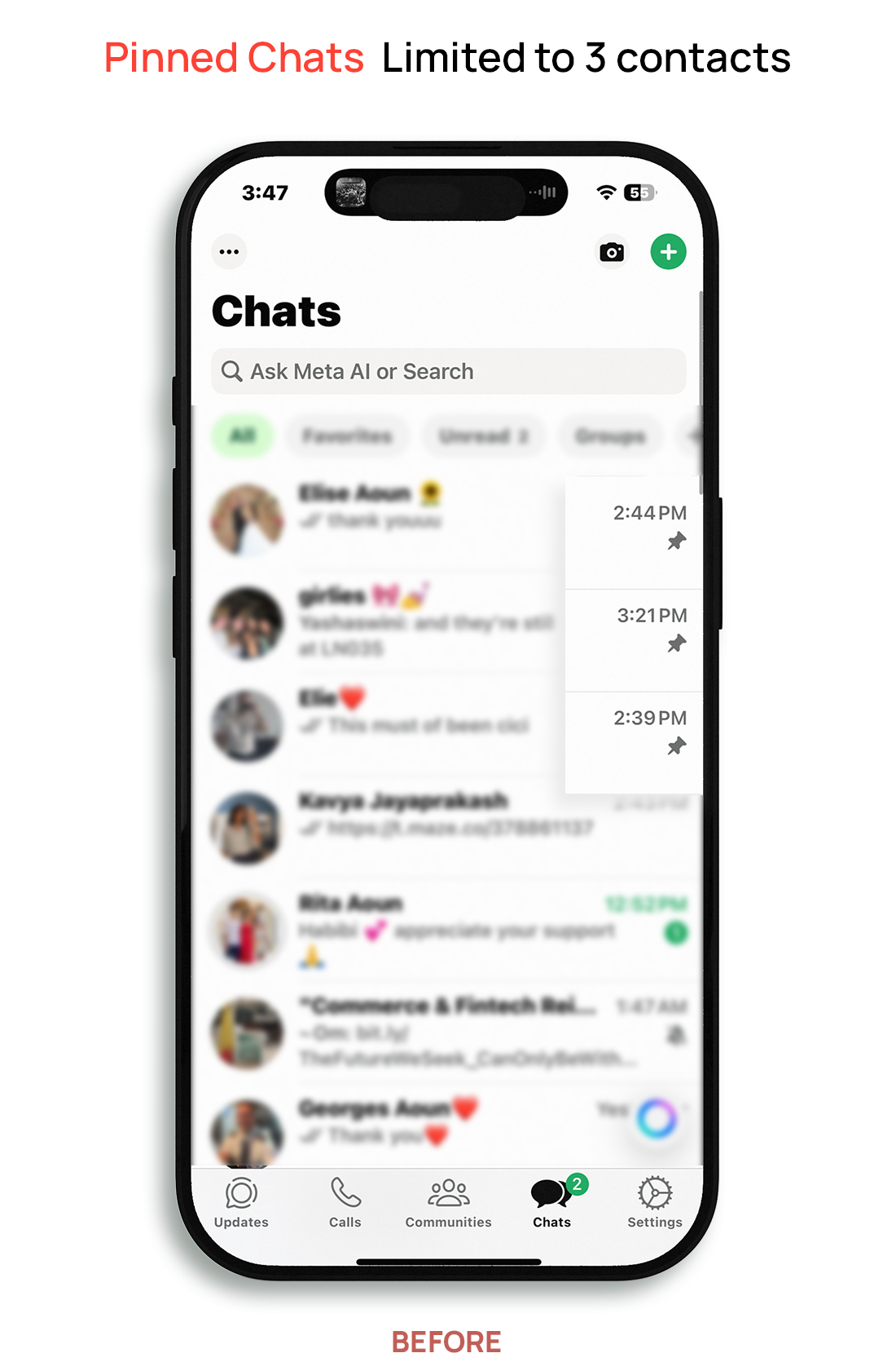
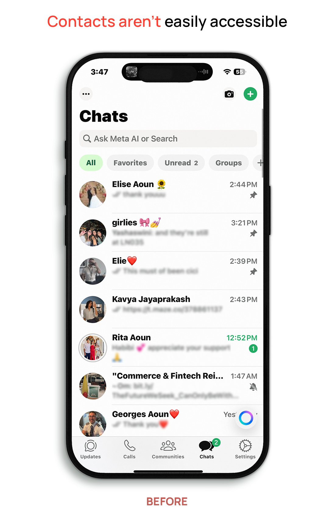
Endless Scrolling
Users struggled to locate conversations due to long, unfiltered chat lists. Many participants chose to scroll through chats to find contacts instead of using the Contacts tab because scrolling felt faster and more familiar.
-
![]()
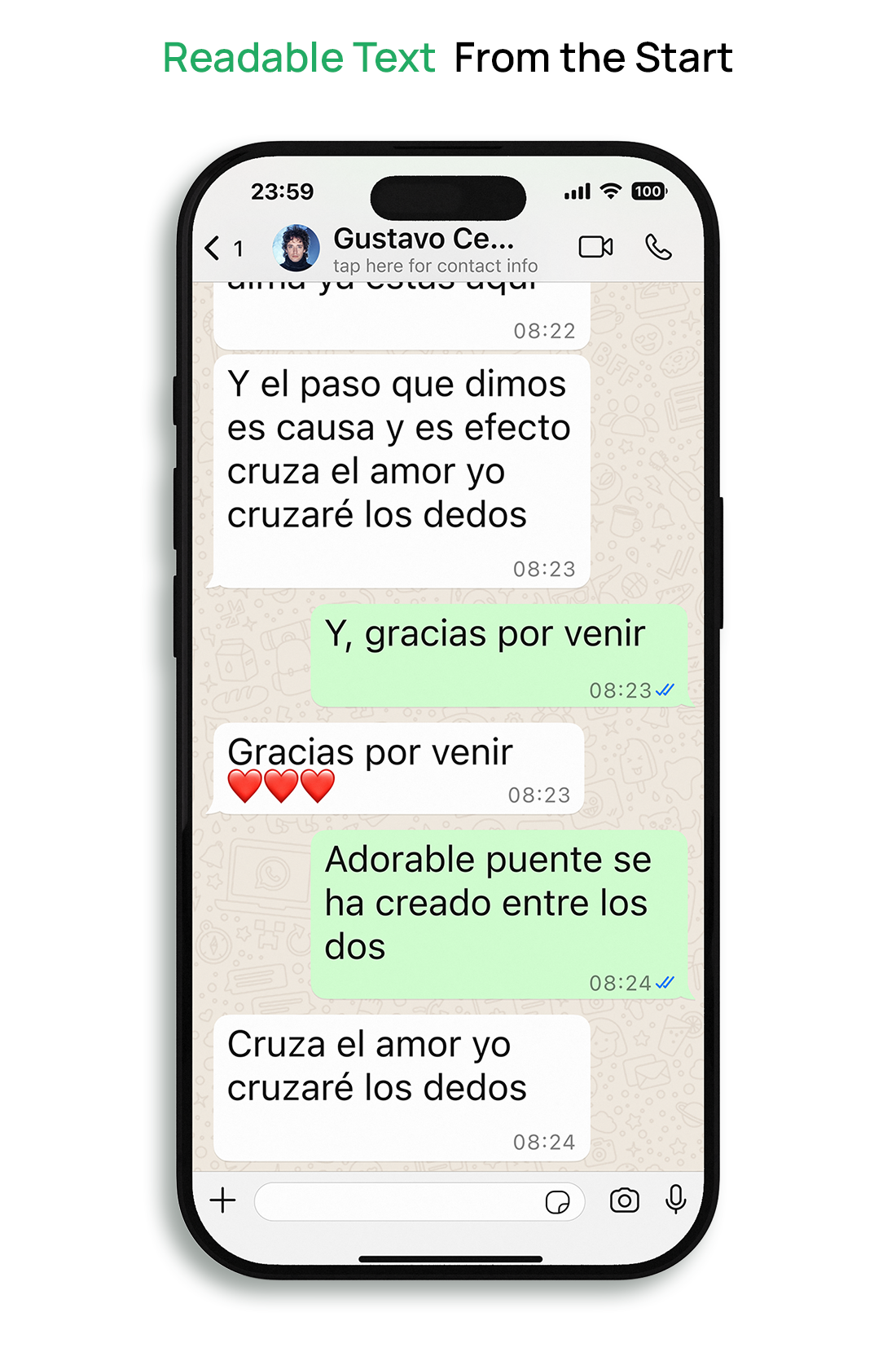
Small Text
Many participants struggled to read messages due to the small default font size, which often led to misread messages. Several users were also unaware that their phones had accessibility settings that could increase text size.
-
![]()
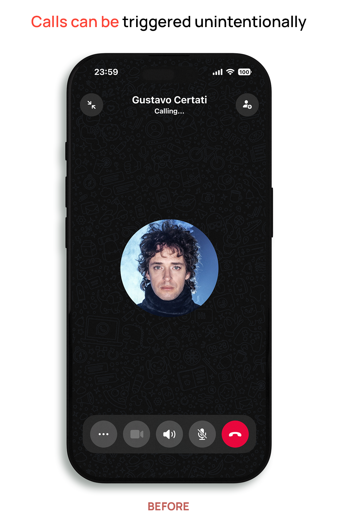
Accidental Calls
Participants often triggered voice or video calls unintentionally due to the placement of the call buttons. Because the interface immediately initiates the call without a confirmation step, small mis-taps often resulted in unintended calls.
-
![]()
Navigation Confusion
Some participants struggled to quickly locate contacts or features within the interface. As a result, many relied on scrolling through chats rather than using built-in navigation options.


Research Methods
To understand the accessibility challenges older adults face when using WhatsApp, I used a combination of qualitative and quantitative research methods.
-
Gathered insights from older WhatsApp users (ages 50–75) to understand frustrations, behaviors, and expectations.
-
Captured behavioral patterns, device preferences, and accessibility pain points at scale.
-
Analyzed real-world usage habits and workarounds during guided tasks.
-
Tested eight conceptual layouts to evaluate which interface patterns older users responded to best.
-
Tested interface features such as font size, contrast, spacing, and button layout to assess clarity and comfort.
-
Used Maze heatmaps to analyze user interaction patterns during usability testing, identifying where participants tapped, hesitated, or struggled to locate interface elements.
-
Conducted task-based usability testing to evaluate how effectively participants could complete key messaging tasks using the redesigned interface.
User Voices: In Their Own Words
User interviews revealed recurring frustrations around navigation, readability, and confidence when interacting with WhatsApp.
Participant, Age 63
"I usually just scroll. I'm afraid to touch anything else."
Participant, Age 68
"The words are too tiny. It's tiring to read."
Participant, Age 71
"I'm scared I'll press the wrong thing and lose my chats."
Participant, Age 60
"Me siento mal cuando me equivoco." ( “I feel bad when I make a mistake”)
Design Solutions
Based on the research findings, four design solutions were developed to improve readability, navigation, and user confidence within WhatsApp.
Design Solutions
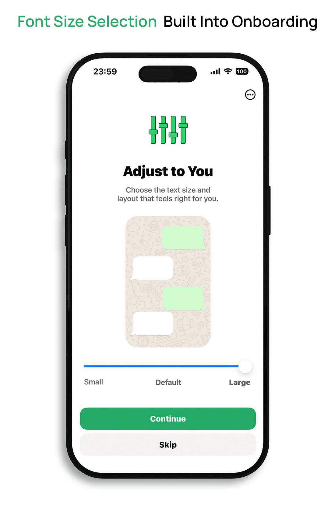
Dynamic Font Scaling in Onboarding
Problem: Small text made messages difficult to read, and many users were unaware that their device offered accessibility options to increase text size.
Design Solution: Added a font size selection step during onboarding, allowing users to set their preferred text size (up to 30pt) before entering the app.
Design Solutions
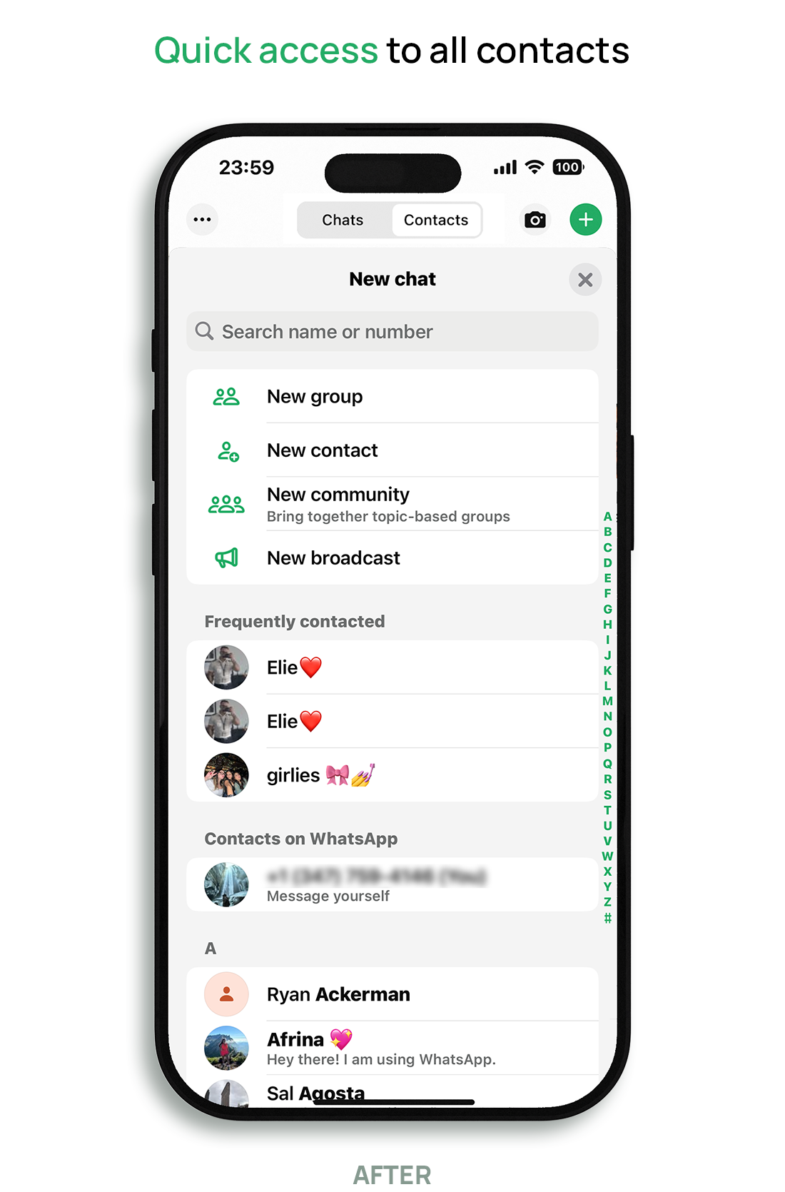
Chats & Contacts Toggle
Problem: Users struggled to find contacts they hadn’t recently interacted with, often relying on excessive scrolling through chat history.
Design Solution: Designed a clearly labeled toggle at the top of the screen to switch between active chats and the full contact list, providing a direct path to both recent and non-recent conversations.
Design Solutions
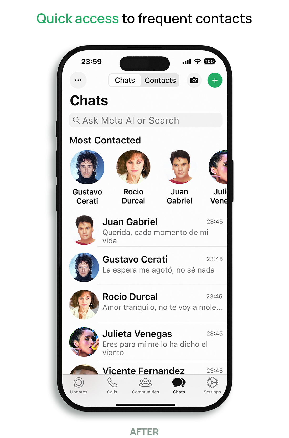
Most Contacted Carousel
Problem: Users often tapped the wrong icon or triggered calls unintentionally due to the lack of a confirmation step, leading to frustration and hesitation to use the feature.
Design Solution: Introduced a “Most Contacted” carousel at the top of the chat screen, surfacing frequently contacted people and providing quick access without scrolling through long chat lists.
UI reflects user-selected accessibility settings, including increased text size, while maintaining platform guidelines.
Design Solutions
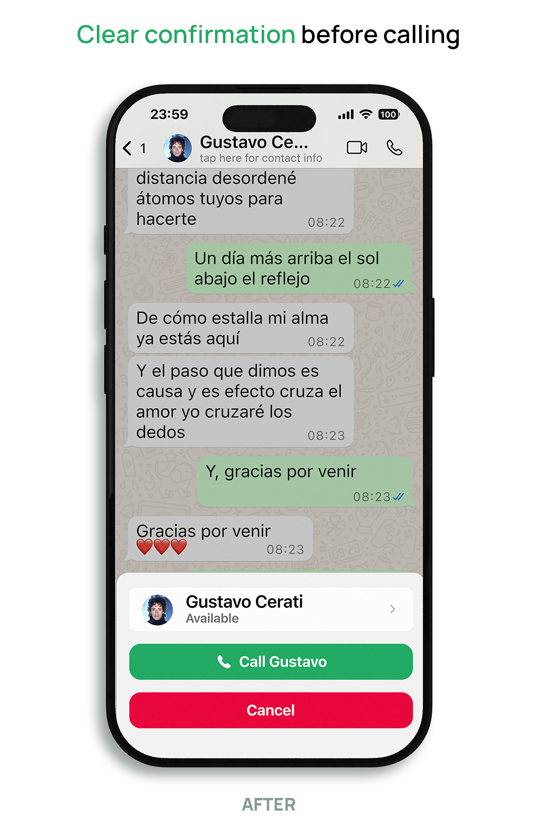
Redesigned Call Confirmation
Problem: Users often tapped the wrong icon or triggered calls unintentionally due to the lack of a confirmation step, leading to frustration and hesitation to use the feature.
Design Solution: Added a call confirmation step that prompts users to confirm or cancel before placing a call, reducing accidental calls and improving control.
Testing & Results
These design decisions were validated through multiple methods, including A/B concept testing, microtesting, and usability testing.
Testing & Results
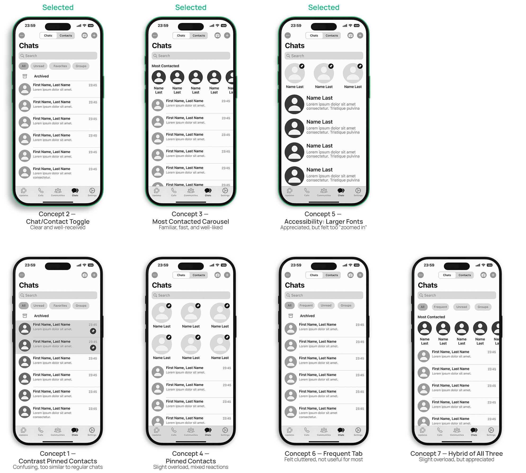
A/B Concept Testing
Before finalizing the design, I tested multiple concepts with older users to understand which approaches were most intuitive and effective. Each concept explored a different approach to navigation, layout, or accessibility. This round of testing helped identify which ideas were worth developing further.
Key Results
The Most Contacted Carousel and Chat/Contact Toggle were the most effective solutions, helping users find contacts faster and with less effort.
Pinned contacts and additional filter tabs created confusion, reinforcing the need for a simpler, more familiar approach.
Accessibility-focused layouts (larger text, higher contrast) were generally appreciated, though some users felt they were too extreme.
Combining multiple features in one layout introduced cognitive overload and led to mixed feedback.
These findings shaped the final design direction, keeping the design simple, familiar, and focused.
Testing & Results
Microtesting
After finalizing core redesigns, I conducted microtesting on key UI adjustments with older adult users. Testing focused on readability, navigation ease, and message clarity — and revealed important nuances in user preferences.
Key Results
Font Size: Most participants preferred 25pt to 28pt; 31pt was readable but felt oversized for some.
Message Contrast: Feedback was mixed—lighter backgrounds (like white) were often preferred for clarity, though green bubbles also tested well.
Call Confirmation: The side-by-side layout was seen as too wide; cancel-first caused confusion. A stacked layout with 'Call' on top and 'Cancel' below reduced mistakes and felt most intuitive.

Testing & Results
Usability Testing
After finalizing key features, I conducted usability testing through Maze to validate the redesigned WhatsApp experience.
7 participants completed 4 critical tasks focused on accessibility, navigation, call confirmation, and error recovery.
Tasks Tested:
Adjust text size during onboarding
Locate a contact using the carousel or toggle button
Confirm a voice call
Recover from an accidental call
Key Results
95% task success on all four test scenarios
Participants described the prototype as “easy to follow”, “more comfortable,” and “less frustrating” than WhatsApp's current interface
Font selection during onboarding was clear, though some participants misclicked due to unfamiliarity with steps
The carousel and toggle improved discoverability—users located contacts faster and with fewer taps
The stacked call confirmation layout reduced accidental calls and was rated as more intuitive
All participants rated the prototype 4 or 5 out of 5 in satisfaction

Reflection
Designing for older adults taught me that accessibility isn’t just about compliance—it’s about empathy, clarity, and trust. Many of the challenges uncovered in this project stemmed from small oversights in interface design that, when compounded, made users feel confused, excluded, or overwhelmed.
Through interviews, testing, and iteration, I realized that even minor UI adjustments—like changing button layout, increasing font size, or simplifying navigation—can have a major impact on usability for aging users. These design shifts didn’t just improve functionality; they also empowered users to feel more confident and connected in their daily communication.
If I were to continue this work, I’d explore:
Voice interaction options for users with limited dexterity or vision
Context-aware onboarding that adapts based on device settings
Error recovery patterns tailored for aging cognition, such as undo prompts or confirmations with haptic feedback
This project reaffirmed my belief that inclusive design is not a constraint—it’s a creative opportunity to build experiences that truly serve everyone.