CareNest: Navigating the Cancer Journey
Role
UX/UI Designer, Researcher, Visual Designer
Timeline
4 weeks (2024)
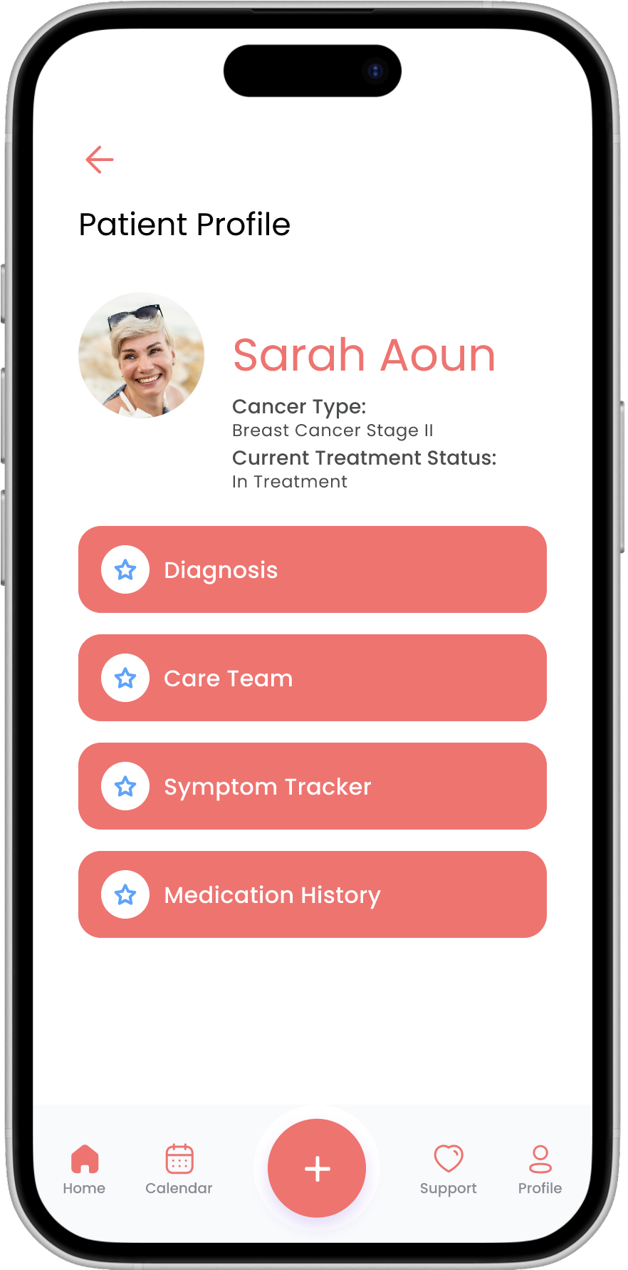
CareNest is a mobile application designed to support cancer patients in managing the emotional, informational, and logistical challenges that arise after diagnosis. The app simplifies complex medical language, offers empathetic navigation, and personalizes patient experiences by combining clarity, emotional support, and organizational tools.
Objective:
To design an application that simplifies cancer-related information, supports emotional well-being, and improves self-management for patients navigating their diagnosis and treatment.
Receiving a cancer diagnosis triggers a complex emotional and cognitive burden. Patients often feel overwhelmed by medical jargon, treatment logistics, and information overload.
This confusion and emotional weight can result in disconnection, mismanagement of care, and stress-induced decision-making. CareNest aims to create a sense of clarity and reassurance by turning complex systems into supportive, guided pathways.
The Problem-
Constraints
Medical Complexity: Balancing simplicity without compromising on critical health information
Diverse Users: Accommodating different levels of digital and health literacy
Data Privacy: Designing within the strict limits of HIPAA and medical confidentiality
User Personas
-

Mike
Newly diagnosed patients feeling overwhelmed by treatment complexity
-

Sarah
Mid-treatment users managing appointments, medications, and side effects
-

Maria
Family members or caregivers supporting patient needs
User Flow
The user flow for CareNest was designed to reduce friction and emotional overwhelm by leading patients through clear, supportive pathways. Each stage focuses on easing access to care-related tasks and information without requiring deep technical experience.
Design Patterns-
Categorized Information Architecture
Purpose: Organize cancer-related content into clearly labeled sections
Problem Solved: Prevents cognitive overload and allows intuitive navigation of resources
Home Screen
Design Patterns-
Mobile Cancer Care Event Calendar
Purpose: Help patients track appointments, treatments, and medications
Problem Solved: Reduces mental load by presenting schedules in a simple, accessible format
Appointment Calendar Screen
Prototype
This section showcases high-fidelity screens created in Figma, illustrating the core flows and UI elements of CareNest—from onboarding and calendar management to emotional support features. While no interactive prototype is linked, these visuals highlight how the design supports accessibility, clarity, and patient empowerment.
Reflection
CareNest was a personal and professional exploration of how design can reduce emotional overwhelm. I learned that emotional accessibility—feeling understood and supported—is just as vital as functional accessibility. The biggest challenge was balancing information clarity with emotional sensitivity. Moving forward, I would deepen the personalization features, explore integration with health systems for appointment syncing, and introduce symptom tracking for longitudinal care insights.


